Monday, September 21, 2009

product placement


visiting anthropologie gave me so much insight to the world of retail design. i drew a lot from our trip there as to how i would make the salvation army select feel special in its own right. one thing i loved was their idea of using little touches on their merchandise to just give it that unique touch. i think that doing that would not only draw the consumer to look more closely at the products but also to make each item feel different and not just like a used item of clothing. i also think it is important to emphasize that everything in the store is different and no two things are alike. i think that would help people focus more on the fact that they are getting something that is unlike that of anything anyone else in the store is purchasing, instead of the idea that its used. i also loved how anthropologie created their displays throughout the store, i know a ton of people that don’t like neccessarily like anthropologies clothing but know them for their interesting and creative display tactics that are unique to their stores.


so this weekend i went for a long walk, read a book in my bed, went shopping at different kinds of stores, and bought fresh flowers.


i thought about what i love to do and what i love about stores when i go shopping. [wandering. catchy displays. relaxing.] these are what gave me inspiration for the new salvation army select.
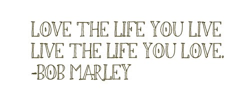
salvation army s e l e c t

Monday, September 14, 2009

timepiece.

this design is meant to show time through the seasons. following my idea of the "laboratory" i decided to think of equipment that is often used in one. the obvious choice was a set of viles and i thought it would be appropriate to display the minerals for the makeup in. being that this is a store meant for designing your own make up and perfumes i thought that this would get that point across. the color of the minerals displayed in the viles would change by the seasons and i felt that would be a good inidcation of time when dealing with make up and the changing colors that people wear throughout the seasons.


when thinking about make up and time i started to think about evolution. throughout time, make up has had many different phases and color palettes. the idea of phases went well with my concept of mitosis and i thought it would be interesting throughout each room to witness change whether it be throughout time or just the transformation of a naked face slowly getting makeup added on to it.


for this design i wanted to mimic the look of a clock without actually having it be a functional timepiece. to do so i decided to once again go with the use of lab equipment and display it like the 4 main times displayed on a clock, filling each one to its respective time. and again i would fill each beaker with different colors that coordinated with whatever season it happened to be.